
This post marks the one year anniversary of the Small Model Railroad web site. The first post “I Miss Carl Arendt!” was a tribute to Carl Arendt who had recently passed away. Those of you who have read the site know that his site and views on the hobby changed my way of enjoying the hobby. I have tried to write about things from a broad spectrum of subjects. Something for everyone, even if they are not wanting to do something small. The plan is to continue writing posts and sharing my thoughts and views on the hobby. This month we will take a look at layout design concepts.
Composition and Design Concepts
When designing a small layout or a scene for a larger layout it pays to do some homework and use some basic layout/design concepts. These layout/design concepts are used in other mediums including painting, sculpting and diorama construction. In all mediums the goal is to present a scene that looks as close to the real thing as possible. This is the same goal we Model Railroaders want to achieve.
The Rule of Thirds
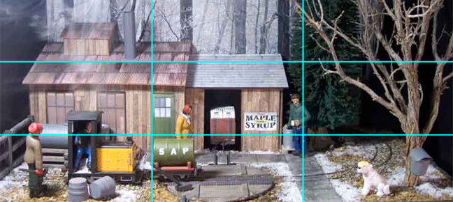
This rule is used by many artists as a basic tool of composition. The rule is to draw imaginary lines across the scene splitting the scene into three equal parts horizontally and vertically. Then align the key features along these lines (more detailed info here http://en.wikipedia.org/wiki/Rule_of_thirds). While our track and trains may move through the entire scene, the extra bits that mimic the real world should be placed along these lines. Some bits could include, figures, mini scenes, buildings, doorways, trees and so on.

In the following image we take a look at Carl Arendt’s Somerset Agricultural Products (SAP) Line. Although we are the mercy of the photographer who took the photo, it is clearly plain that the scene is split into thirds. Even the sky and roof line are approximately 1/3 of the scene. The far right edge of the building and the figure align with the RH line. The track and travel of the train align with the bottom third.
Designing with Forced Perspective and Vanishing Point
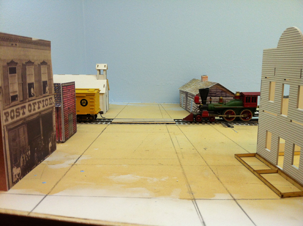
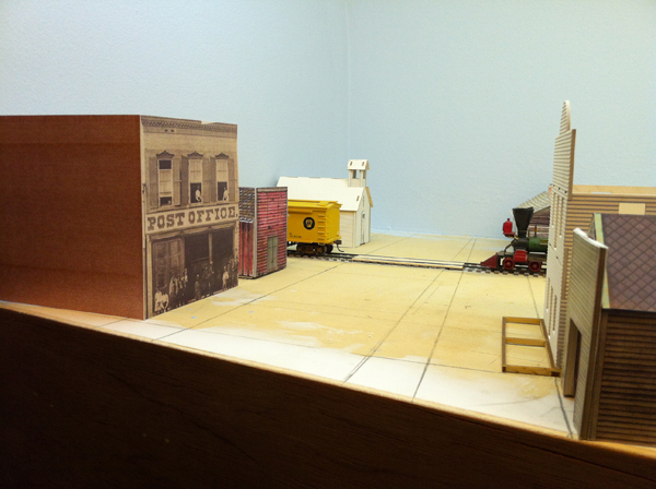
A sense of depth helps to provide the scene with a more realistic feel. Many model railroaders add smaller figures and buildings to the rear areas of the layout, but there is much more that we can do. While designing the scenes for Mound City 1862 I wanted the viewer to look into the scene and see further than the 18 inches that was presented. To do this I knew I would have to use some Forced Perspective to get it done. One of the first things I did (other than the basic track plan) was to lay out the roads using a Vanishing Point. At the front of the layout, the road be wide as in the prototype. As it moved toward the rear of the scene the road would narrow. I could not do this too suddenly as the trains half way back in the scene would expose the illusion. I choose a vanishing point that was several feet beyond the back of the layout. I will hide the edge rear edge with a layering of building flats and other view obstructions. So far I have just started the buildings but the mock-up shown below shows great promise for the use of the vanishing point.
Layering Objects
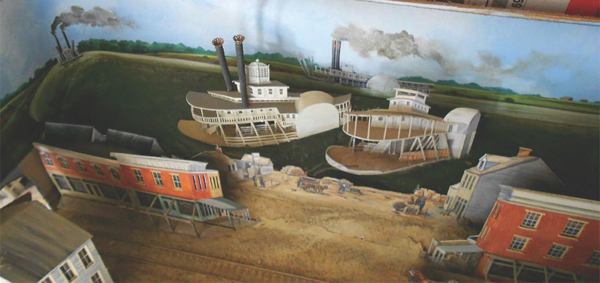
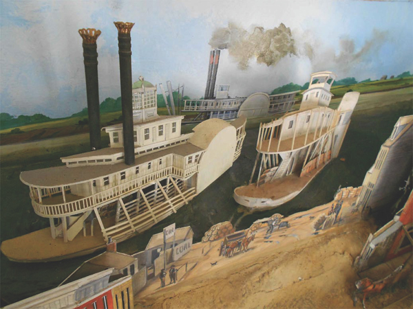
The use of background buildings and flats is not new to model railroading. The layering of flats and the use of exaggerated angles can also suggest additional depth. The following images are from a series of dioramas produced by Brian G Kammerer. Brian’s depiction of a street scene in Hannibal MO shows the technique very well. The scene appears to have depth and it is not easy to see where the actual buildings stop and the background begins.
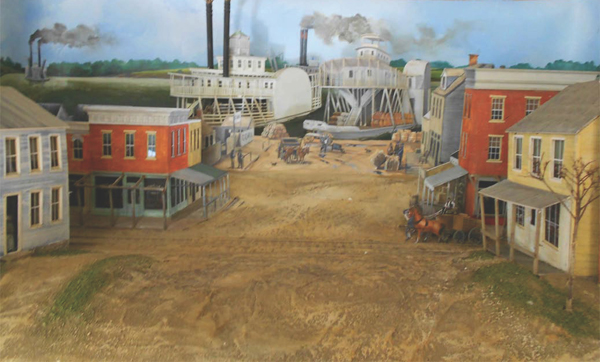
In the next couple images we can see how Brian fooled the viewer with buildings that were almost completely flat. The odd angles used on the side walls of the buildings gave an additional impression of depth. The entire scene is really only a few inches deep.
Only Model What Will Be Seen
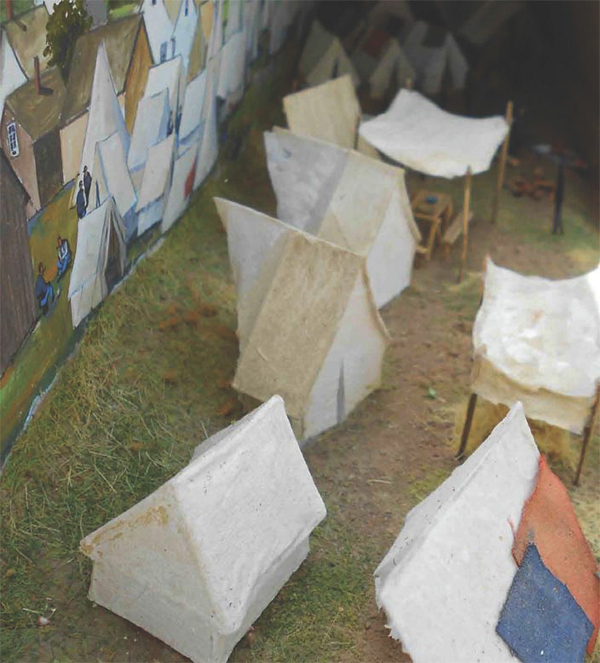
When building structures, it is common to think of four walls, full roof and foundation. Within the layout you only need to think of the few angles that the scene can be viewed from. The viewers mind will automatically fill in the blank spaces. Below is a scene from the diorama Union Camp, Culpepper, VA by Brian G Kammerer. When viewed from the front all appears complete and even the depth seems deeper than it really is as the mind puts space between the background and the row of tents.
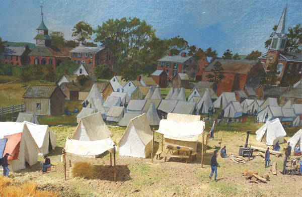
In actuality there is not enough room behind the tents to complete the tent. Brian has only modeled what was seen and our mind has filled in the rest.
Conclusion
Using these techniques can increase the depth and perception of the model railroad scenes. As my layout Mound City 1862 progresses, I plan on using more of these techniques.
About Brian G Kammerer
Brian is an accomplished artist with 35 years of Advertising experience and is a member of the Yahoo Civil War Model Railroading Group. You can find out more about Brian’s artist background at http://www.bkmmrr-art.com/ and his Civil War Battle Map Art project at http://www.cwbattlemapart.com/. Brian is also the creator of a movie called The Other Great Locomotive Chase (http://www.toglc.com/). The movie is a fantastic model railroad parity to the original Great Locomotive Chase.
I really love the forced perspective examples here. Your blog and ideas are very innovative. I also love that you cite references.