It is amazing how some ideas take on a life of their own! When I posted the original article on the challenge, I was hopeful a couple people might take interest. Although I have personally been too busy to work on my own display case layout, others are moving full steam ahead. Let’s look at what some people have done and where they are headed!
Facebook has been very active with several people making progress on actual layouts. I made it a point to challenge Bob Chant via Facebook to see what ideas he might have for such a small space. For those who do not follow Facebook, Bob has been an active personality on the Micro/Small Model RR Layouts (and other small layout groups) group. Bob has posted many layout designs for small spaces, but he had not tackled anything this small before.
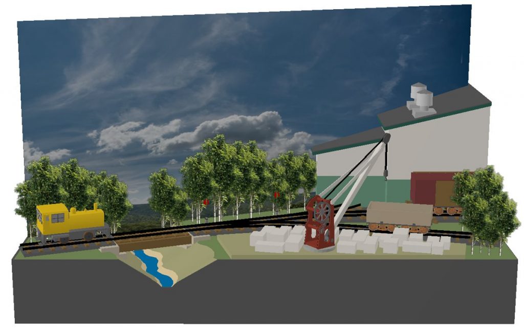
Bob took up the challenge and designed a remarkable little layout design! He used the football helmet display case and split it into two scenes, each visible from opposite sides of the display case. Bob created not one but two micro layout scenes in this very small 13 x 9 x 9 inch (33 x 23 x 23 cm) space! For those with a Facebook account the link to the full post is https://www.facebook.com/groups/728920213839816/permalink/2770253003039850/. For those not on Facebook (aka The Evil Empire) read on!
Per Bob’s Facebook post:
Earlier today Marshall Stull asked me to come up with an entry for a challenge he has opened on his small layouts website. The challenge was to design a micro layout to fit in 13″ x 9″ x 9″ helmet display case that he had just purchased. Since I have never designed a layout for such a small space, I was intrigued by the idea and agreed to give it a hook.
I have to admit that it was quite daunting at first when I tried to use ready-made turnouts. It wasn’t long before I realized that not very much would fit in the space if I used traditional design methods and standards. So, I tossed out 20 years of design experience, and took on a new approach to layout design.
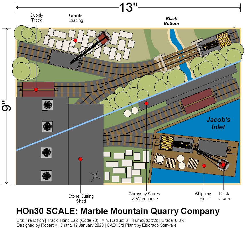
The first new element that had to be added was a turntable so the entire space could be used. The turntable had to be small (its only 4″ wide) so the rolling stock had to be small as well. A small loco and a 14-foot railcar will just fit. I also had to go with 6-inch radius (Yes, I cringed at that too) and #2 turnouts. Once I accepted all that, I then focused on developing a theme for the layout, and I finally settled on a granite quarry and stone cutting mill with a small dock area.
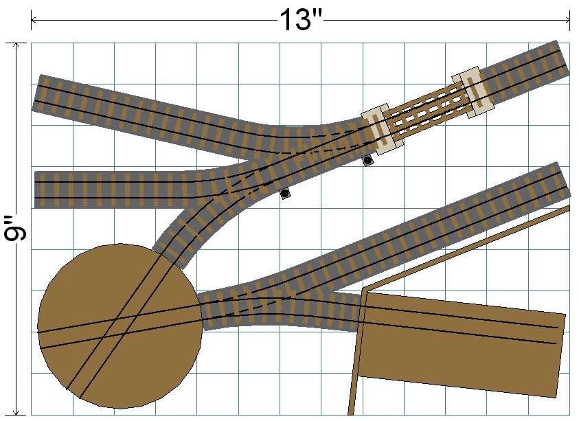
Incoming supplies come in by water, and are transferred from the wharf to the company stores. When supplies are needed at the mill, they are transferred in a small box car from the warehouse to the mill’s supply track. Raw cut granite slabs are loaded into either small gondolas or on flat cars, and taken to the mill for finishing. The 4-inch turntable is hidden inside the mill building, and serves at the run-around track for the complex. Finished granite products can either go out via the wharf, stored in the warehouse, or left on the ground outside the cutting shed until shipped out.
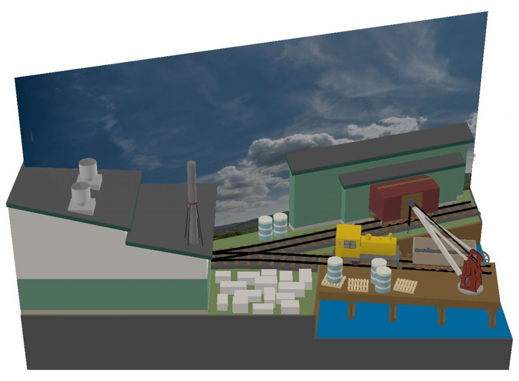
In the end, I was quite surprised at how much I was able to fit into the space, and still leave some room for scenic elements. While I don’t like the standards used in the design by any means, it was the trade-off that had to be made to get what I wanted in the space. Overall, I am pleased with the result and it was a great change of pace for me.
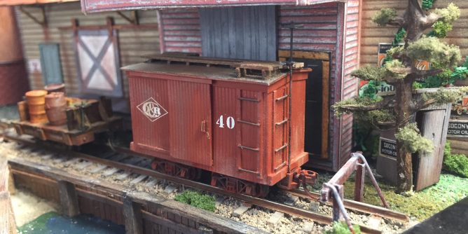
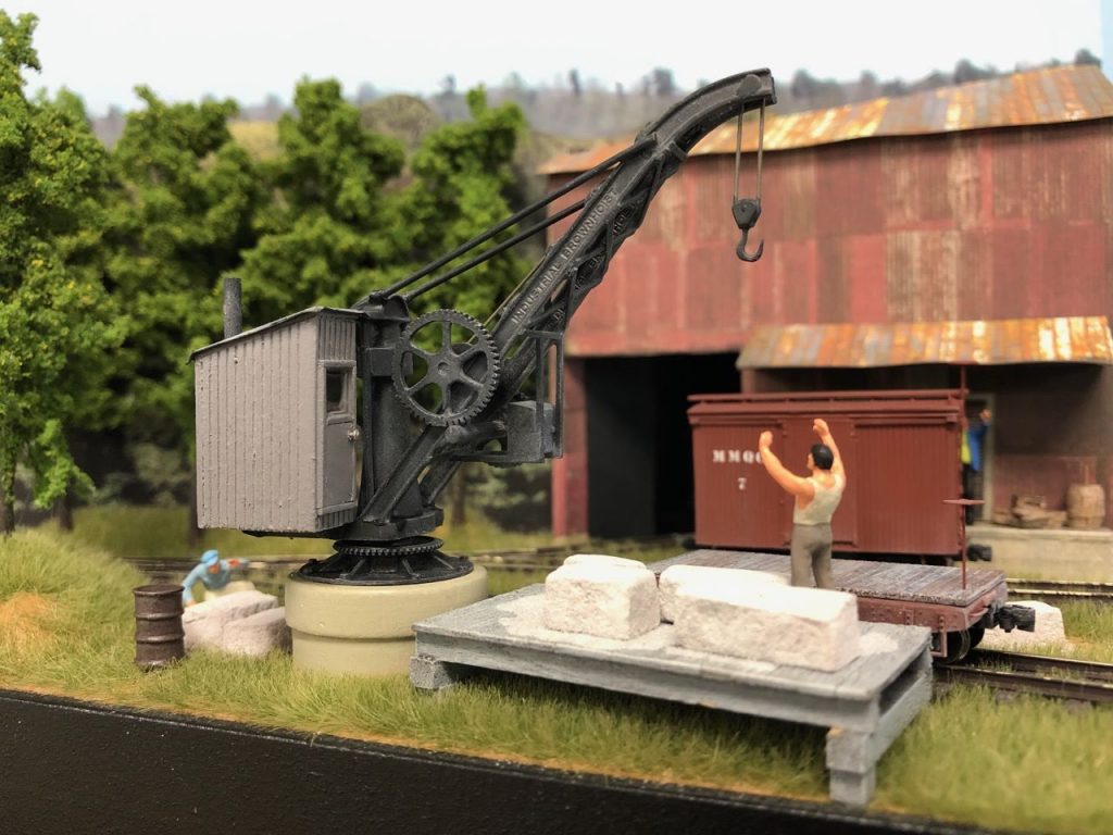
A couple people have taken Bob’s design and have begun construction. One that has come very close to completion is by Chris Broughton. Chris’s Marble Mountain Quarry Company layout follows Bob’s design almost exactly. Minor adjustments were made for the turntable and his rolling stock of course.
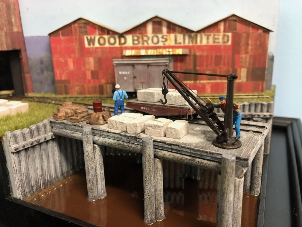
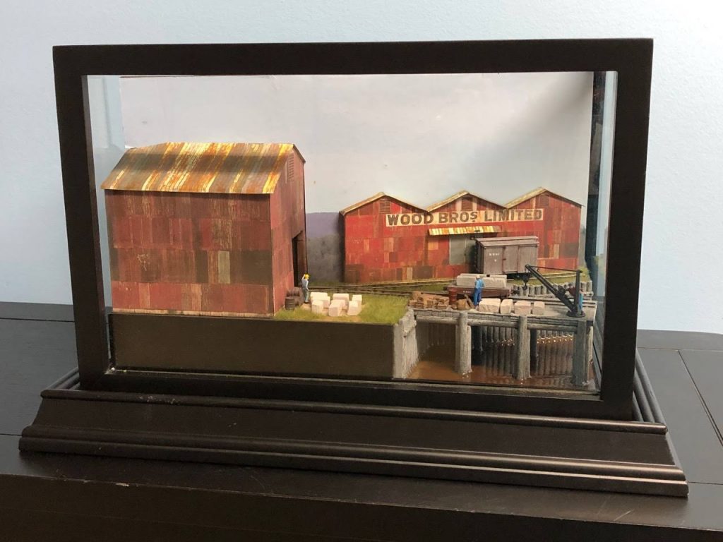
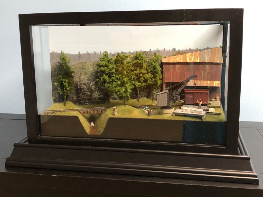
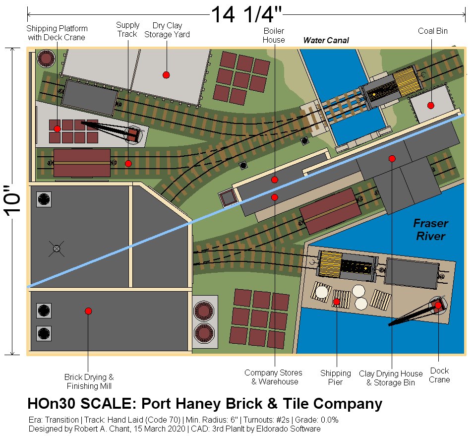
Another layout based on Bob’s design is the Port Haney Brick & Tile Company being built by David Fugere. Bob Chant altered the Marble Mountain Quarry Company design to create the Port Haney Brick & Tile Company. David has made some minor adjustments to fit his equipment and turntable.
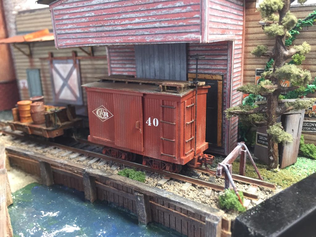
All of the above layouts have used the helmet case but the challenge was to use any sports memorabilia display case. It was not long and I received information on a very novel layout being built to fit in a baseball bat display case by Bill Byrnes. Bill’s N scale layout is 38.5″ x 5.13″.

Bill’s design is a variation of the Inglenook Sidings layout and includes single track ferry. This N scale design is a half sized copy of his HO Inglenook sidings layout that is 65 x 14 inches. Construction of the micro has started with a styrofoam and wood base.


Some people have asked me if the layout challenge was still going! The Display Case Layout Challenge is for ALL of 2020. Periodically through the year we will take a look at progress and new attempts into the challenge. In December I plan on a big review of all the layouts from the year.
Please feel free to post information on about your layout to the original post or any follow-up posts. I will be compiling and contacting people for updates and information as the year progresses. Please be safe out there in these trying times!!
